Marc Saporta
Inspiration for my final project
Introduction by Tom Uglow, Google and YouTube
With diagrams by Salvador Plascencia
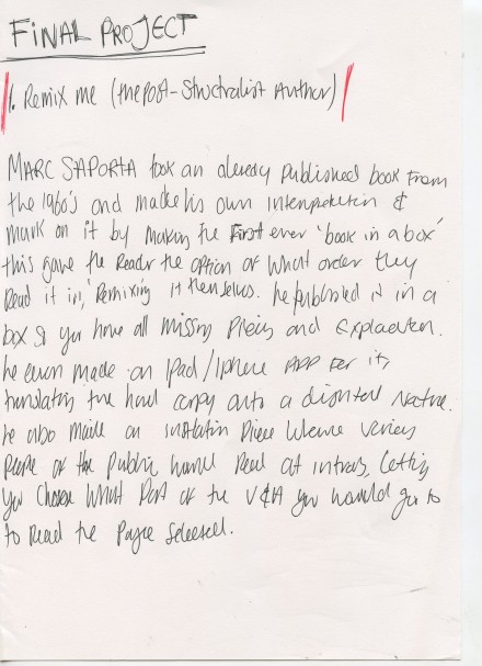
Composition No. 1 is a re-imagining of a book originally published in the 1960s. The book is the first ever “book in a box”, by French writer Marc Saporta. When we say book in a box we mean: quite literally a book that comes in a box with loose pages. Each page has a self-contained narrative, leaving it to the reader to decide the order they read the book, and how much or how little of the book they want to read before they begin again. In so many ways, Composition No.1 was published ahead of its time: the book raises all the questions we ask ourselves today about user-centric, non-linear screen driven ways of reading.
With this in mind, we approached Tom Uglow of Creative Labs Google and Youtube to write an introduction for the book. This re-imagined edition also includes several of Salvador Plascencia’s (author of The People of Paper) drawings, looking at all the different components that make up a “typical” book. The book is designed by Universal Everything, UK-based design studio known for their interactive screen-based work.


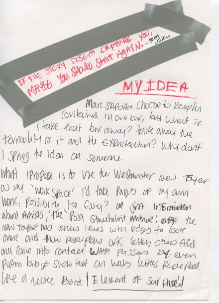
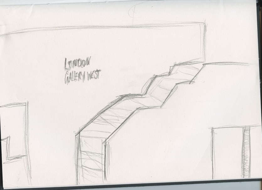
Sketch of the foyer for where i would place posters, fly paper airplanes and leave various bits of paper. the element of surprise will hopefully engage the person more. letting them read their own way around the work. >>>>
<<<< Here shows diagrams of levels people can stand, where posters can be placed and where paper planes can be flown from, giving the element of surprise to the reader, using their own interoperation of how they want to read various text layouts.
These scans of word documents show how they would be seen when flown, i personally think the 1st set of 3 are the best layout, as more text is seen from all views, regardless if you can catch an airplane or just find one on the floor, i like the set of 3 collums rather than one block of continuous text, it breaks it up a bit, giving it a better visual than just one solid block of text. >>>>